
Behind the Build
Brzy Digital
5 min read

Behind the Build
Brzy Digital
5 min read
Just an FYI - the screenshots are based on dummy data - from a CSV that I prepared for testing and a test artist account!
I wanted to continue sharing the Syncd:in build journey, and one thing that’s been really important to me is this:
How do you make “boring” data actually engaging?
Before, we were sending out statements to artists. Useful? Yes. Exciting? Not really.
Now, it’s about taking that same data and bringing it to life — making it something artists actually want to look at, understand, and use.
Data is everything for an artist.
We’re talking:
Song metrics
Follower and fan metrics
Fan location data
Song popularity
Where music is performing best
Where income is actually being generated
This isn’t just “nice to know” — this should drive decision making.
And if it’s not… it probably should be!!
One thing I noticed when speaking to artists is that they don’t want to scroll through endless statement data.
They want: 👉 quick, clear insights 👉 high-level overviews 👉 the option to deep dive if they choose to
So the focus became consolidation.
Using the Spotify API, one of the key additions was track popularity — a simple but powerful metric that adds real context.
From there, I focused on a few core metrics:
Top earning song
Top earning platform
Total revenue generated
That’s it (for now).
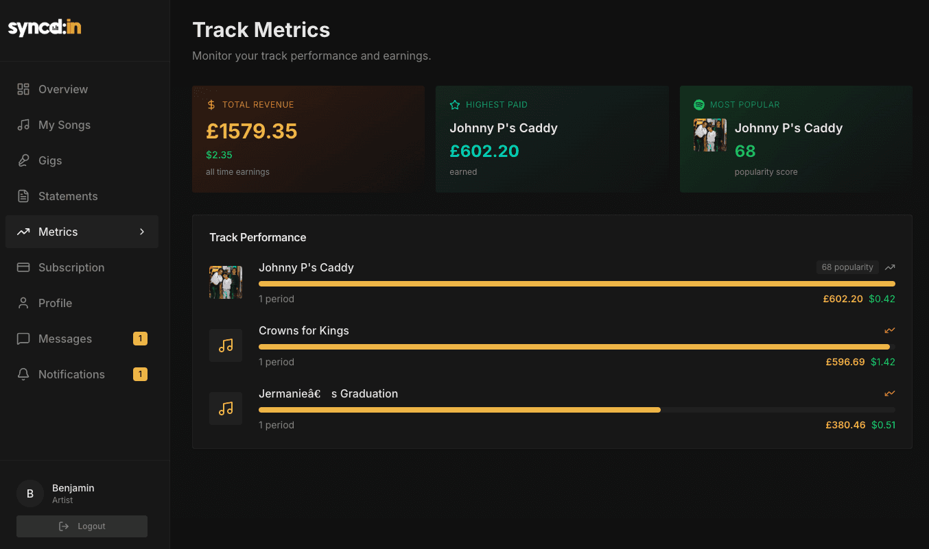
For artist managers, the view naturally shifts — because they’re looking across multiple artists.
So their dashboard includes:
Top earning artists
Top earning platforms
Total revenue per artist
Total revenue overall
Same data. Different perspective.
Everything you’re seeing comes from one simple CSV file. Which just reinforces something I keep coming back to:
It’s not what you have — it’s what you do with it.
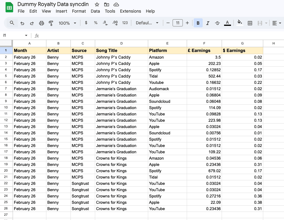
Once the CSV is uploaded, the system:
Calculates the platform fee
Identifies top earning songs
Calculates total earnings
Analyses top performing platforms
Pushes all of this into the relevant artist dashboards
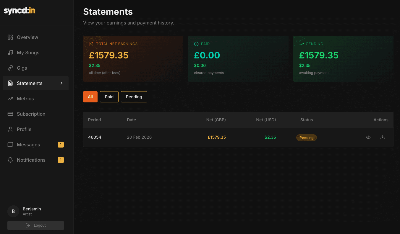
All pulled from the database and displayed in a way that actually makes sense to the user.
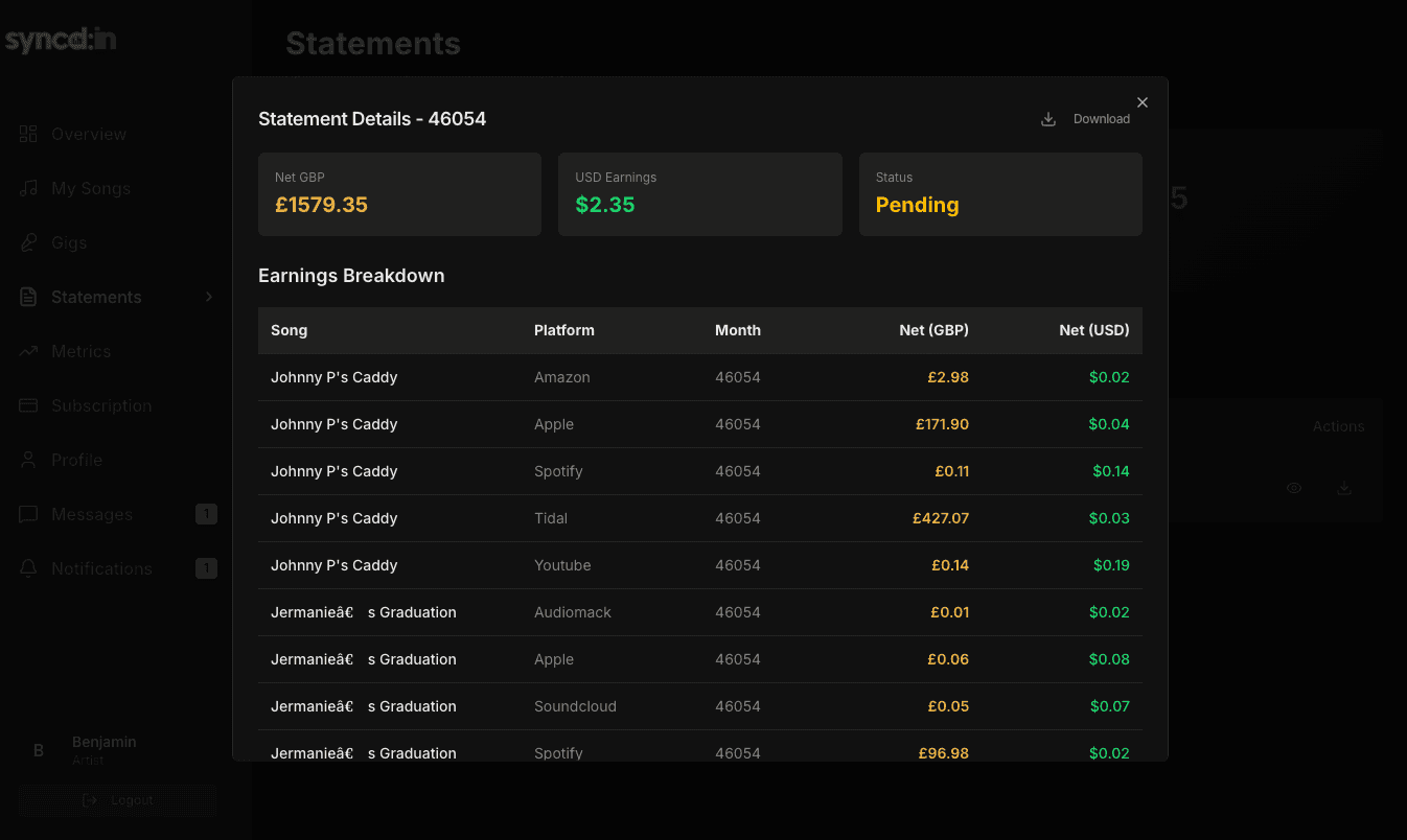
You’ll see from the images how this is displayed — clean, simple, usable. There’s always more data we could add… But there’s a balance.
Too much data = cluttered dashboard = no one uses it. So growth here needs to be intentional.
A stretch goal would be to pull data directly from collection societies into the platform — removing the need for manual uploads entirely.
We’re working towards that.
For now, the CSV flow works — and more importantly, it works well.
I’m always interested in how others are working with data. What are you doing that’s actually making data more useful, not just more available? You can always contact me: admin@brzydigital.co.uk or connect on Linkedin
Whether it's spreadsheets, CRM data or customer information, the real value comes from presenting it in a way people can actually understand. We help businesses transform complex information into intuitive digital products and dashboards. Try the free Brzy Digital assessment.
Explore Your Product Idea

